Oct 3, 2026Buying Guides
How to Style Gold Wall Art: Palettes, Pairings and Rooms
Gold wall art suits far more than classic interiors. How to pair gold metal art with colour palettes, materials and lighting—and the mistakes that make gold look cheap.

Gold wall art carries more stylistic range than its reputation suggests. The same gold sculpture reads opulent against marble, grounded against walnut, contemporary against black, and almost industrial against concrete. The difference is never the gold itself—it is everything around it.
What "gold" actually means in metal art
Modern gold wall art is not gilded framing. PVD-coloured stainless steel produces gold tones that range from pale champagne to deep antique, applied over mirror, brushed or textured bases. The base finish changes the read completely: gold over mirror is brilliant and responsive; gold over brushed is warm and architectural. The colour families and their behaviour are covered in PVD finishes explained.
Palettes that make gold work
Three pairings cover most successful gold schemes:
Gold + marble + warm neutrals. The classic luxury combination: cream and honey stone, walnut, ivory textiles. Gold reads expensive because the palette already speaks the same temperature.
Gold + deep green or navy. Dark, saturated backgrounds turn gold into jewellery—the contrast makes even a restrained piece feel jewel-like.
Gold + black + concrete. The contemporary read: matte black and raw concrete keep gold sharp and architectural rather than ornate. This pairing suits loft apartments and modern hospitality.
What fails: gold against busy multi-coloured backgrounds, or gold competing with large chrome surfaces. Both make the finish look loud rather than rich.
Pairing gold with other metals
Gold rarely lives alone. The mixing rules—hierarchy, repetition, undertone—are covered in how to mix metal finishes in one interior. In summary: let gold lead in warm schemes, support it with black or bronze, and keep any silver elements small and deliberate.
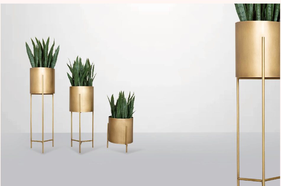
Floor pieces extend the gold story beyond the wall: brushed gold planters and stands repeat the tone at different heights without repeating the same object.
Where gold wall art belongs
Living rooms take the boldest gold statements, usually above the sofa or console.
Bedrooms suit softer champagne tones with brushed textures—warmth without glare at bedtime.
Entries and dining rooms can carry deeper antique golds, where candle-warm lighting enriches the tone.
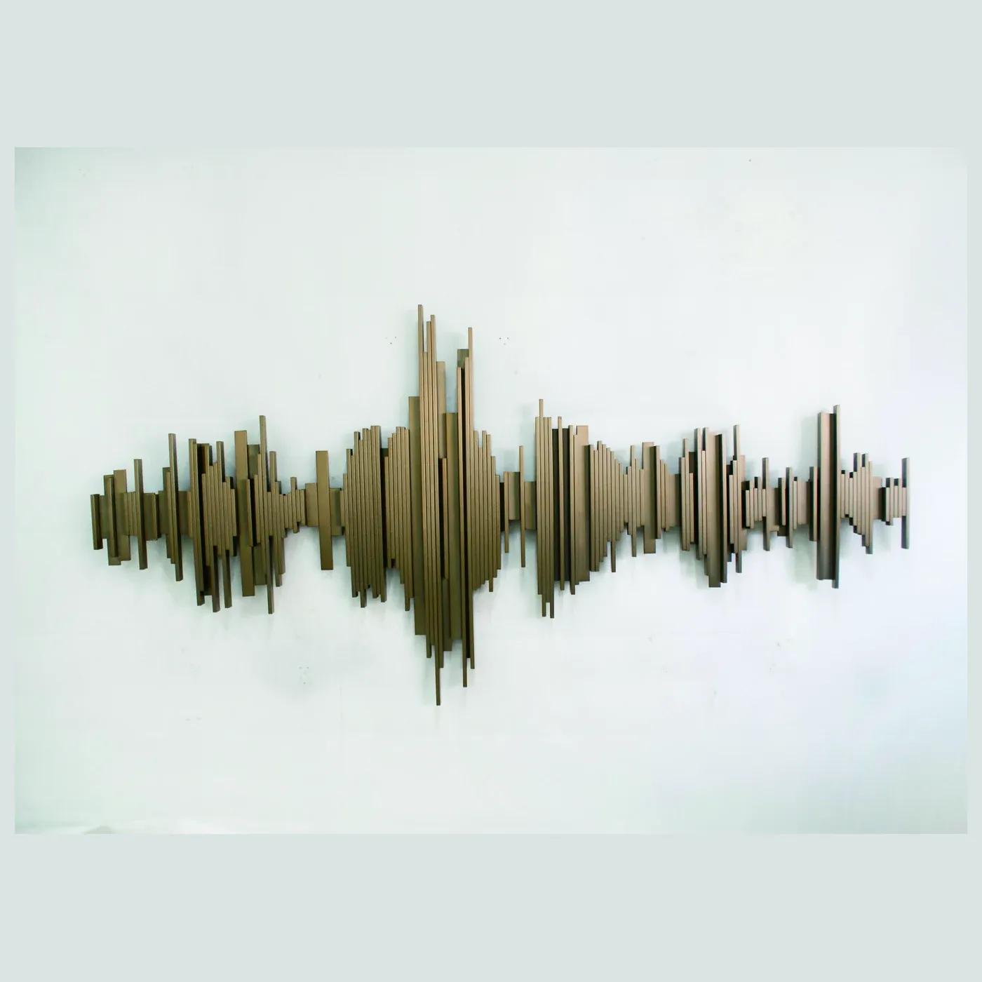
Hospitality is where gold earns its commercial keep: lobby feature walls and reception backdrops under warm architectural lighting.
The lighting factor
Gold under cool 4000K light can look greenish; under warm 2700–3000K it glows. Before specifying, confirm the room's lighting temperature—or choose a champagne or bronze tone that performs across both. Directional lighting adds a second dimension: gold relief surfaces produce moving shadow lines that flat art cannot.
What makes gold look cheap
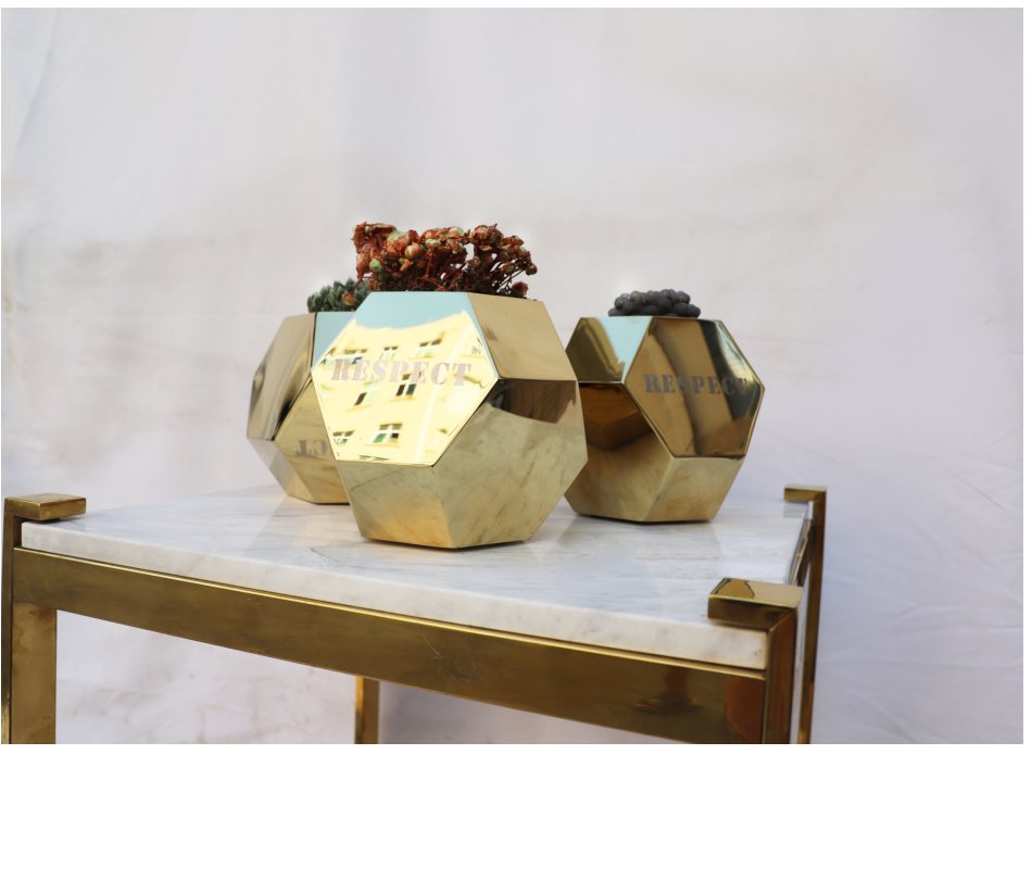
Three avoidable errors: mirror-gold in every room (overdose), gold against clashing colour backgrounds, and thin flat "gold-look" material without depth. Quality gold PVD over solid stainless with real relief avoids all three—the weight and depth are visible from a metre away.

Choosing a gold piece
KingDeco Studio produces gold and champagne PVD wall art over mirror, brushed and textured bases—browse the collection or contact the studio with your palette and wall dimensions for finish recommendations.